

Logos: Colors or Black & White? Which One Works Best for Your Brand?
When you think of famous logos — like Apple, Nike, or Coca-Cola — what’s the first thing that comes to mind? Their color or their design?
That’s the big debate: logos — colors or black & white? Choosing between a colorful logo and a black-and-white one can feel like picking between creativity and simplicity. But the truth is, both have their strengths — and the right choice depends on your brand’s personality, message, and audience.
Let’s break down everything you need to know before deciding which logo style best represents your business.
Why Your Logo Design Matters So Much
Your logo is the face of your brand. It’s the first thing people recognize, the visual mark that builds trust and recall.
Whether you’re running a small startup or an established company, your logo communicates:
-
Who you are
-
What you stand for
-
How professional your brand is
-
The kind of emotions your audience should feel
A well-designed logo can make your brand memorable, while a poorly chosen one can make it forgettable. That’s why deciding between color vs. black-and-white logos isn’t just a design choice — it’s a branding strategy.
The Power of Color Logos
Color can instantly grab attention and create an emotional connection. It’s one of the strongest tools in a designer’s toolkit.
Why Businesses Love Color Logos
-
Colors evoke emotions
Each color has psychological meaning. For example:-
Red → Energy, excitement, passion
-
Blue → Trust, reliability, calmness
-
Green → Growth, freshness, balance
-
Yellow → Optimism, creativity, happiness
-
Black → Luxury, sophistication, power
A color logo helps brands express their personality immediately.
-
-
Instant recognition
Think of McDonald’s golden arches or Facebook’s blue icon — you know the brand just by seeing the color. Consistent use of color builds recognition over time. -
Stronger visual impact
In crowded markets or social feeds, bright and well-chosen colors make your logo stand out. -
Versatility in marketing
Color logos look great in digital ads, social media posts, and product packaging. They catch eyes and create emotion faster than text.
When Color Logos Work Best
A colorful logo is a smart choice if:
-
You’re in a creative industry (like fashion, design, or entertainment)
-
You want to express personality or energy
-
You aim to attract younger or trendier audiences
-
You plan to use your logo heavily in digital marketing
Color logos are perfect for brands that want to be vibrant, emotional, and memorable.
The Timeless Appeal of Black and White Logos
While color logos scream creativity, black and white logos whisper elegance and simplicity. They strip away distractions and focus purely on form and meaning.
Why Brands Choose Black & White Logos
-
Timeless and classic
A black and white logo never goes out of style. It’s clean, minimal, and forever professional. -
Easier to adapt
Whether printed on paper, etched on products, or used in grayscale versions, monochrome logos stay consistent across all mediums. -
Focuses on shape and structure
Without color, the strength of your design depends entirely on your typography, lines, and shapes. This makes the logo easily recognizable in any size or format. -
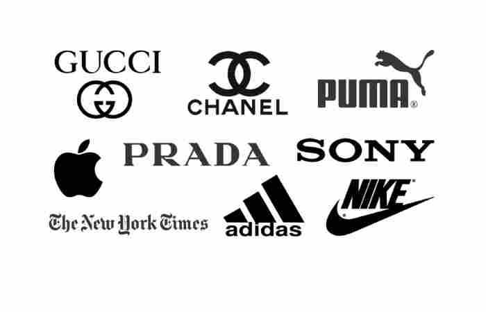
Elegant and professional
Monochrome logos are often used by high-end, luxury, and minimalist brands. Think of Chanel, Prada, or Apple — simple but powerful.
When Black and White Logos Work Best
A black and white logo fits perfectly if:
-
You want a luxury or premium feel
-
Your brand focuses on professionalism and timelessness
-
You prefer a minimalist aesthetic
-
Your products or branding materials are often printed or engraved
Black and white logos communicate confidence and clarity — perfect for brands that believe less is more.
Color vs. Black & White Logos: The Real Difference
| Feature | Color Logo | Black & White Logo |
|---|---|---|
| Emotion | Evokes feelings instantly | Neutral and sophisticated |
| Recognition | Builds quick recall through color association | Builds recall through strong form |
| Adaptability | May lose impact when printed in grayscale | Works everywhere |
| Cost | Higher printing and reproduction cost | Cost-effective for all formats |
| Best For | Youthful, creative, energetic brands | Elegant, timeless, luxury brands |
Both types can be powerful — it all depends on how you want your brand to be perceived.
The Psychology Behind Logo Colors
Let’s go a bit deeper. If you’re considering a colored logo, choosing the right shade can make all the difference.
Popular Logo Colors and What They Mean
-
Red: Passion, urgency, and power (Coca-Cola, YouTube)
-
Blue: Trust, stability, and calmness (Ford, IBM, Facebook)
-
Green: Nature, health, and balance (Starbucks, Whole Foods)
-
Yellow: Positivity and creativity (McDonald’s, Snapchat)
-
Purple: Luxury and imagination (Cadbury, Hallmark)
-
Orange: Energy and fun (Fanta, Nickelodeon)
-
Black & White: Elegance, simplicity, and confidence (Nike, Apple)
Each color tells a story — pick the one that fits your brand’s message, not just your favorite shade.
Can You Have Both? Absolutely.
Here’s the truth — you don’t have to choose only one. The smartest brands design logos that work in both color and monochrome versions.
Why Every Brand Needs Two Versions
-
A color version for digital media, packaging, and ads.
-
A black-and-white version for print, embossing, or watermarking.
When done right, both versions should look equally strong — that’s the sign of a truly versatile logo.
Example:
-
The Nike swoosh looks iconic in black, white, or any color.
-
Apple’s logo works perfectly in silver, black, or rainbow hues.
If your logo still looks great without color, that’s a design win.
Tips to Choose Between Color and Black & White Logos
If you’re still unsure which to pick, here are some simple but powerful guidelines:
1. Think About Your Brand Personality
-
Colorful = fun, creative, youthful
-
Black & White = serious, elegant, trustworthy
Match your logo style to the emotions you want to evoke.
2. Test in Different Mediums
Check how your logo looks:
-
On a website
-
On business cards
-
On packaging or merchandise
-
In small or large print
If it loses clarity or appeal in black and white, it may need redesigning.
3. Consider Longevity
Trends come and go, but timeless logos stay relevant for decades. Ask yourself — will this design still work 10 years from now?
4. Budget and Printing
Full-color printing costs more. If you’re a small business, a black-and-white or minimalist logo can save you money while still looking classy.
5. Focus on Simplicity
Complex, color-heavy logos often struggle to stay memorable. Simple designs — in color or black and white — are easier to recognize and reproduce.
Mistakes to Avoid When Choosing a Logo Style
Even great brands make errors when it comes to logo design. Watch out for these:
-
Too many colors — it looks cluttered and unprofessional.
-
Poor contrast — some color combinations are hard to read.
-
Ignoring grayscale versions — every logo must look good in black and white.
-
Following trends blindly — what’s trendy today may look outdated tomorrow.
Always prioritize clarity and meaning over complexity or decoration.
The Perfect Formula: A Flexible Logo System
Modern brands often use a flexible logo system — a design that works in multiple variations depending on context.
This means:
-
Full-color version for digital use.
-
Black-and-white version for formal or print use.
-
Single-symbol or icon version for app icons or watermarks.
A flexible logo gives your brand freedom and consistency everywhere.
Final Thoughts: Logos — Colors or Black & White?
At the end of the day, there’s no single right answer. The best logo isn’t defined by color — it’s defined by how well it represents your brand.
-
If you want emotion, vibrancy, and attention — go for color.
-
If you want elegance, simplicity, and timeless appeal — go for black and white.
-
If you want flexibility — have both.
Your logo should look just as powerful on a billboard as it does in grayscale on an invoice.
So, when it comes to logos: colors or black & white, choose the one that tells your brand story best — and never forget that great design is about balance, not excess.