

5 Signs Your Online User Experience Is Failing You
In today’s digital world, your online user experience (UX) can make or break your business. Customers expect fast, smooth, and intuitive experiences whether they’re using a website, app, or online store. The problem is that many businesses don’t realize their UX is failing until it’s too late — traffic drops, bounce rates increase, sales decline, and customers quietly move to competitors.
If you’re wondering why users aren’t engaging the way they should, or why your conversions seem stuck, it might be time to evaluate your UX. Below are the five biggest signs your online user experience is failing you, along with what you can do to fix them.
Your Bounce Rate Is Increasing
One of the clearest indicators of poor user experience is a rising bounce rate. A “bounce” happens when a user visits your website and leaves without taking any action — not clicking a button, not visiting another page, not making a purchase.
When bounce rates increase, it usually means something is turning visitors off within the first few seconds.
Common causes of high bounce rates:
-
Your website loads too slowly
-
Your design feels outdated
-
Users can’t find what they’re looking for
-
The page is overwhelming or cluttered
-
Your content doesn’t match user intent
Why this is a major issue
People today make decisions instantly. If they don’t find your website visually appealing or easy to understand, they’ll exit and find another option immediately. Bad UX pushes them away before they even explore what you offer.
What to do
-
Improve page loading speed
-
Simplify your design
-
Use clear headlines and visual hierarchy
-
Ensure content aligns with what users search for
-
Use white space to make pages feel cleaner
UX starts with the first impression — if that fails, everything falls apart.
Users Struggle to Navigate Your Website
If users have to “think too much” while navigating, your UX is failing. A well-designed website should feel effortless. Users should instantly know where to click, where to find information, and how to complete a task.
When navigation becomes confusing, users get frustrated — and frustrated users leave.
Signs your navigation is confusing:
-
Users frequently hit the back button
-
You receive support queries asking “Where is ___?”
-
Important pages are buried behind multiple clicks
-
Your menu is overloaded with options
-
Your layout changes too frequently
-
People abandon their shopping carts mid-way
Why navigation matters
Great navigation creates flow. Poor navigation breaks user flow, and once that happens, your chances of converting drop significantly.
How to fix it
-
Make your navigation bar simple and predictable
-
Place important actions (login, sign-up, cart) clearly
-
Use breadcrumbs for deeper pages
-
Organize content into clear categories
-
Provide a search bar that actually works
-
Avoid hidden or overly creative menu designs
When users don’t have to think about where to go, they stick around longer — and take more actions.
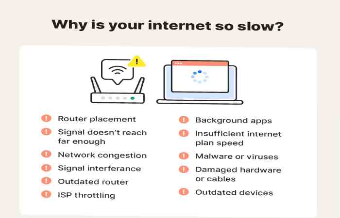
Your Website or App Loads Too Slowly
Speed is everything in the digital world. If your website takes more than 3 seconds to load, you’re already losing a large percentage of visitors.
Users today expect instant performance — especially on mobile. A slow site doesn’t just ruin UX; it deeply affects SEO, conversions, and even brand trust.
Why slow loading happens:
-
Heavy images
-
Too many plugins
-
Cheap or overloaded hosting
-
Poor coding structure
-
Auto-playing videos
-
Unoptimized mobile design
Why slow websites fail
Research shows:
-
Every 1-second delay reduces conversions by up to 7%
-
40% of users leave if a site takes over 3 seconds to load
-
Slow sites rank lower on Google
Slow speed kills user experience before it even begins.
What you can do
-
Compress images
-
Use browser caching
-
Minimize scripts and plugins
-
Use a better hosting provider
-
Implement lazy loading
-
Optimize for mobile performance
Fast-loading websites build trust and convert better. If speed is an issue, fix it immediately — it’s one of the most crucial UX elements.
Your Mobile Experience Is Weak or Broken
More than 60% of global web traffic now comes from mobile devices. If your mobile experience is not optimized, you’re losing half your audience.
A poor mobile UX is one of the top reasons people leave a website. Even if your desktop site is perfect, it won’t matter if the mobile version is broken or difficult to use.
Signs your mobile UX is failing:
-
Buttons are too small
-
Text is hard to read
-
Content doesn’t adjust to the screen
-
Navigation becomes confusing
-
Pages require too much scrolling or zooming
-
Mobile load time is slow
-
Pop-ups cover the screen
Why mobile UX matters
Users expect mobile experiences to be as smooth as apps: fast, stable, and simple. If they struggle on mobile, they won’t switch to desktop — they’ll simply leave.
How to improve your mobile UX
-
Use responsive design
-
Make buttons thumb-friendly
-
Increase font size
-
Reduce clutter
-
Test your website on different screen sizes
-
Prioritize speed
-
Remove intrusive pop-ups
A clean, responsive, mobile-first design is no longer optional — it’s essential.
Users Aren’t Completing Conversions
You may get traffic, but if people are not signing up, buying, subscribing, filling forms, or taking the key actions you want — your UX is failing somewhere in the conversion journey.
A failing UX creates friction, confusion, and frustration, all of which kill conversions.
Common conversion issues:
-
Checkout process is too long
-
Forms ask for too much information
-
Buttons are unclear or not noticeable
-
Price or shipping costs appear too late
-
Users can’t find trust signals like reviews
-
Lack of payment options
-
Too many steps to complete a task
Why this matters
Users leave when the process feels difficult or time-consuming. Simplicity equals conversion.
What you can do
-
Reduce steps in checkout
-
Use autofill and shorter forms
-
Highlight CTAs clearly
-
Display transparent pricing
-
Add trust badges, reviews, and guarantees
-
Offer multiple payment options
-
Make the journey predictable
Small improvements can dramatically increase conversions and make users feel confident completing transactions.
Additional Signs Your UX Might Be Failing
Besides the five major signs above, here are a few more warnings many businesses ignore:
-
Users often complain about the design
-
Your website feels outdated
-
Your search function doesn’t return helpful results
-
You use complicated jargon instead of simple language
-
There are broken links or errors
-
Your pages have too much or too little content
-
You rely on intrusive pop-ups
-
Your branding is inconsistent
These issues may seem small individually, but combined, they create a frustrating digital environment.
What Good UX Looks Like
To understand what failing UX looks like, it helps to know what successful UX includes:
-
Fast loading
-
Clean layout
-
Simple navigation
-
Predictable design patterns
-
Consistent branding
-
Helpful content
-
Mobile responsiveness
-
Clear calls to action
-
Accessibility for all users
-
Modern, visually appealing design
-
Strong security cues
-
Zero friction in the customer journey
Good UX feels invisible because everything “just works.”
How to Improve a Failing User Experience
Improving UX isn’t about guessing; it’s about understanding users and fixing barriers that stop them from completing actions.
Here’s where to start:
Audit your website
Check speed, layout, mobile performance, design, pop-ups, and broken elements.
Study user behavior
Use tools like heatmaps, session recordings, and analytics.
Ask users for feedback
Real users will always tell you what’s wrong.
Simplify everything
Menus, forms, buttons, checkout pages — make everything shorter and easier.
Test multiple versions
A/B testing helps you see what works best.
Update your design
Modern, clean design boosts engagement immediately.
Prioritize accessibility
Your site should work for everyone — including users with disabilities.
Your goal is to remove friction and create a smooth, pleasant journey for every user.
Final Thoughts
If you want your business to succeed online, user experience must be a top priority. A failing UX drives customers away, hurts your reputation, lowers conversions, and impacts your long-term growth. The good news is that most UX issues can be fixed with the right approach — faster speed, simple navigation, clean design, mobile optimization, and frictionless conversion paths.
When users enjoy interacting with your website or app, they stay longer, trust your brand more, and convert at higher rates. Fixing your UX is not just a technical improvement — it’s a powerful business decision that pays off in traffic, engagement, and revenue.