
A recent study revealed that 85% of purchase decisions people make based on color. Email is your method of communication with people and converting leads. So you need to use colors to evoke a positive emotion in your recipients to get what you want. The success of your email campaign and efforts depends on how well you leverage the use of colors to affect the emotions of your audience.
Each color has its meaning, so you as an email marketer should understand the science behind them. This comprehensive tutorial on using colors in email marketing will help you increase the number of converted leads and grow sales.
Table of Contents
Psychology of colors
The psychology of color deals with how colors influence human behavior. Our feeling, mood, and, subsequently, behavior are triggered whenever our eyes see color. According to a research, 93% of customers pay attention to the visual appearance of a product when making a purchase, with 85% claiming the product color to be the reason #1 for buying it.
The visual elements, such as the design, colors, and images, are the appealing factors in your email copy. Yet, what triggers the interest or might also cut it at the root is the color combination. Selecting the proper color and color combinations for your email marketing campaign can be the determining factor in making your brand outstanding.
You can change the thoughts, feelings, and attitude of your audience towards your brand with colors. It is important to understand the psychology of colors to use them right on your website and in your email campaigns.
Black
Black is characteristic of elegance, power, mystery, and authority. This is the reason it is associated with important items and fashion logos. The black color is also commonly used for texts, as it is easy to read.
Negative aspects: If you design your email with too much black, it may evoke negative feelings, such as a sense of unknown and scary.
White
White demonstrates humility, simplicity, cleanliness, and innocence. E-commerce platforms widely use it as the background for product images. It is recommended that you use a black text on a white background in your emails as this color combination is the most readable.
Negative aspects: Too much white evokes a feeling of boredom, emptiness, and incompleteness. This is the reason why plain-text emails are considered unimaginative and boring.
Red
Red is the most intense color, among others. It is used to signal passion, prominence, action, and energy. Use it to capture attention; the best option is call-to-action buttons (Order now or Click here). This color is so visible that you can use it to create an accent in plain texts and trigger instant human decisions.
An A/B test carried out by Hubspot indicated that there was a 21% increase in the conversion rate with a red CTA compared to a green one.
Combine the red color in your emails with basic colors. White or shades of gray make it more appealing and effective.
Negative aspects: Traditionally, red stands for danger. It is too bright for a person’s eyes, and too much of it can even cause eyesore (an angry customer is a bad customer:-)).
Yellow
Oh, one of my favorite colors! I love it because of the variety of feelings you can evoke with its help. On the one hand, yellow portrays sunshine, positivity, optimism, and childhood. On another side, too much of a good thing is good for nothing, and it may cause a feeling of sickness and boredom.
Quite often, companies use yellow for the background of their website, and it also fits the “free shipping” bar at the top of a website. Yellow is also very bright, which makes it compatible with dark backgrounds. It helps draw the readers’ attention to crucial aspects of your content.
Negative aspects: Yellow is considered to be unstable, childish, and annoying.
Orange
Orange revolves around creativity, balance, enthusiasm, and success. Even with its attractiveness, orange is not as commanding and overwhelming as red. Orange also creates a sense of impulse and urgency, and it gives any email a bit of fun.
Use the orange color as a bright spot in your email to draw the attention and push subscribers to make a purchase.
Negative aspects: Like the yellow color, orange in emails can evoke the feeling of sickness and deceit.
Green
Green has a strong connection with money and nature. It symbolizes growth, health, generosity, and fertility. Green is ideal for marketers in the health and fitness industry, and you can use it for the background, logo, and banner image. Green, with other colors such as white and blue, represents calmness and peace.
Brighter greens are livelier and more dynamic, while darker shades of green express more of growth and stability. This color offers a relieving effect against depression and influences positive connection as it represents nature. If you deal with money, use green color in your email marketing campaigns as it symbolizes financial growth.
Negative aspects: Some shades of green are associated with negative emotions such as envy.
Purple
Purple is a color of royalty and a higher social status. It depicts power, wisdom, luxury, and spirituality. Including bits of purple in your email copy makes it appear uplifting and encouraging. This is why companies connected with beauty and anti-aging products often use it. Combining purple with other colors, like yellow and brown, establishes prestige and dominance.
Use purple to create a fantasy of a royal solution and to relax your readers. Design your brand logo in purple colors and include it in every email you send. This will make your email copy look creative and outstanding.
Negative aspects: Overusing this color can result in a feeling of arrogance and frustration.
Blue
Blue is considered the most secure and positive color in the world. Selecting the proper shades of blue brings a relaxing and soothing effect on your emails. At the same time, dark blue encourages reliability and power.
Blue is effective for brands promoting creative and high-tech products, and it is a favorite color for most men and women, which makes it a one-size-fits-all color to use in your email campaign. Besides this, it encourages trust, which is why it is used by some brands to establish credibility.
Negative aspects: Too much blue, light blue, or overusing it can cause frigidity and hostility.
Gender preferences
Right from birth, there has always been color variations and preferences among genders. Males are most often wrapped in blue blankets or have a blue painted nursery while females are associated with the pink color. This is not the deciding factor, but there’s still some generalization deducted from several recent studies.
The major element that comes into play is deciding on the most appropriate color scheme to use in your email campaign, depending on the gender of your audience. According to a review by KISSmetrics, males and females prefer different colors and color combinations. This means that you need to know this information to target people right.
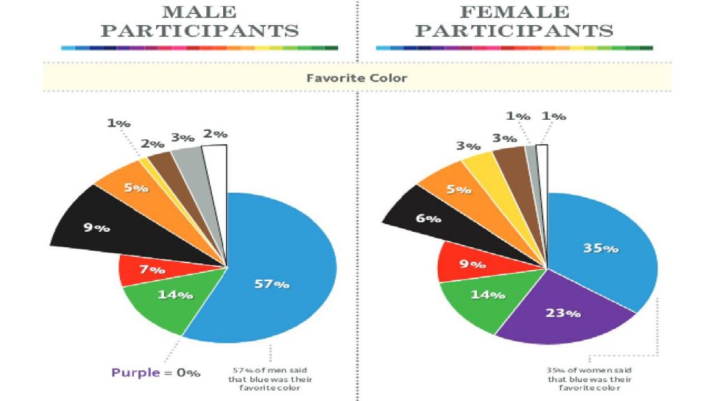
Studies carried out on the color preferences for both male and female revealed the following:
-
- Blue is the color both males and females love
- The less popular color for females is orange
- Males do not favor the brown color
Nonetheless, regular testing and data collection are required to determine the most effective color combination that works best with the gender of your audience.
Color schemes
The importance given to colors is connected with the emotional response it generates in your audience. You use them to direct your subscribers to a specific message or action. There is no particular color combination that is perfect for every email campaign as its choice depends on your brand identity, the objectives of your email strategy, and customer demands.
An email with lots of colors is distracting, less captivating, and much confusing. Combine 2 (3 at maximum) colors and keep in mind: you need one bright color to draw the attention of your readers to the most significant parts.
Here are some tips on how to combine colors in emails:
- Opposite colors: a combination of opposite colors is excellent as you can use one of them for the background and the second color for the accent (for example, yellow and blue, red and black, red and green, etc.)
- Pastel colors are well-combined, and you can do this easily. They are great as they do not irritate the eye. Use a specific tool like Copeden to get the color scheme you need.
- Natural colors: use color themes that appear in nature and are easily read. Let’s say, bright red and orange are associated with grapefruit, shades of blue read blueberry, orange and green is 100% mandarins or oranges, etc. Turn your imagination on, copy Mother Nature, recollect what you know, and do it!
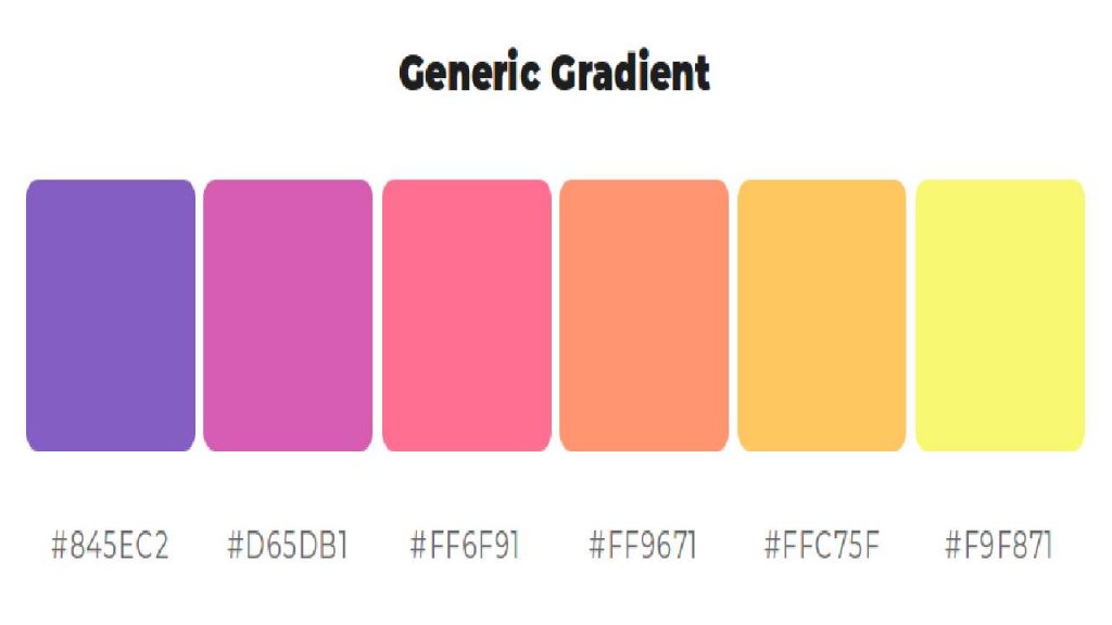
- Shades of the same color work great for emails. Choose one color, use a special tool to get its gradient (for example, Canva or ColorSpace), insert one contrast color to highlight the CTA, and get it done.
Some professionals advise changing the used color schemes in emails from time to time. There are both pluses and minuses. On the one hand, your emails become recognizable, and the subscribers won’t confuse you with someone else. At the same time, they can get bored with the chosen color combination. My own opinion is like this: do change the colors and color schemes in emails but always leave a few recognizable elements.
Tip on using colors in your emails
Colors, without any doubt, have proven to be effective in email marketing. But how can you leverage these opportunities to achieve a successful email campaign? Below, you can read a few actionable tips on how to use colors in your emails.
- Add color to your ALT text: Alt text, also known as the alternative text, is the text displayed whenever an image in an email does not show due to some reasons. Use it to be sure that every recipient sees your email content and performs the desired action. Also, It’s an opportunity for you to use colors in the ALT text to make it brighter and more appealing.
- Use color tabs and labels to arrange your content: You can improve the readability and arrangement of your content with color labels and tags.
Create color tabs, similar to that of Buzzfeed, to categorize your stories and include additional information for your audience. Add a small label to the top of your email to catch your reader’s attention and instantly inform them of what to expect in the email copy.
Another way to use color in emails is to insert a bright CTA button in the plain-text email. For example, you can use the Gmail Button extension to create CTAs for emails right in Gmail: use colors, write the text, set the border, insert the link, and save it. That’s all, an attractive CTA for your plain-text email is ready.
- Settle for a color scheme: Ensure that the colors selected for your call-to-action buttons and headers complement the images in your email. This technique gives a modern appearance to an email and consolidates the aesthetic of the email. Use web tools like HTML Color Codes to complement the precise color from an image.
- Be creative about adding color to your text: It is not compulsory to always use a black text for your email. The most important thing is that it is well-contrasted with your background color and easy-to-read. Try out other colors in your text to offer something new contrary to the usual black that is already common. Create different colors for your headers and sub headers to help your readers understand the content and how it is arranged.
- Design contrasting CTA buttons: The CTAs are among the effective methods of using colors in email marketing. Your audience should be able to recognize the location of your CTA by making it stand out from the rest of your email. Set your CTA button apart by using a separate color for the element that houses it. This will make the button stand out in the background of your email.

- What to do if you are bad at combining colors: Firstly, you may ask your designer to create a color scheme for this or that email campaign. If they do not do this for you, use the company’s corporate colors. And finally, take colors from nature, it already knows which colors go well together.
- Be patient on colors: Unfortunately, too many colors may influence email deliverability in a negative way so to avoid spam filters, do not use more than three colors in your emails.
Final thoughts
An important element of your email marketing efforts is the creative and effective use of colors. Wrong colors may affect your marketing aims negatively. Thus, select the appropriate color combinations.
People are different, and everyone prefers different colors. So you need to constantly test your email campaigns to see what works for them better.
Choose an email marketing app, design your emails, insert bright CTAs, and may your email campaigns prosper!
Author’s bio: Helen Holovach is a copywriter at Snov.io, a cold outreach automation platform. Helen is passionate about email marketing and research but in her free time, she loves reading, sitting by a campfire or singing songs to a guitar.