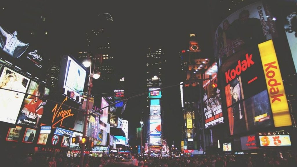
When designing billboards and signs, there are a lot of things to consider. You want each element to work cohesively in order to get your message across. Because of its size, it can prove quite difficult to design billboards effectively. But when armed with the right information, you can create a huge advertising structure that’s just as effective as the smaller ones.
If your next project assignment is to design billboards and signs, then don’t worry. We’ve got you covered! These 5 tips will help you design the perfect billboard that matches the location, the materials, the typography, and everything in between and you can also check Signarama for this.

-
Think about the size of the billboard
The key to designing a billboard is to know how much space you’re working with. Some designers underestimate how large a billboard can be. For example, a standard bulletin billboard is around 14 feet high and can stretch to about 48 feet wide. That’s a lot of space to put design elements on. To make things easy for you, think about the size of the billboard and how it can affect your concept. From there, you can make changes that best suit the billboard’s dimensions.
Some billboards appear wider and some billboards appear more squarish. Remember that people only glance on a billboard for a few seconds while driving so make sure the message is instantly visible upon first glance.
-
The location of your design matters
Another factor worth considering is the location of the billboard. Will it be placed way up on the highway? Or will it be located on the ground as a yard sign? This is important because the location of the billboard (or sign) will affect its visibility. Billboards are obviously more visible than yard signs due to the latter’s small dimensions and ground location.
Ideally, you want the sign to remain visible in spite of weather conditions, traffic situations, and the surrounding environment. To achieve this, you’ll have to use contrast the right way. We all know how important contrast is to any design project, but it becomes even more important when you only have a few seconds to capture someone’s attention.
To create contrast, consider adding a border on the billboard’s design. The border will help create separation between the billboard design and the surrounding environment for a clearer, better view from a driver’s or pedestrian’s perspective. A simple black or white border that encases your design can help set it apart from other elements that may veer off people’s attention.
-
Use the right colours
The colour choices you make when designing a billboard can make or break its visibility, thus making it crucial to select the right colours during the design process. Not only will the right colours help the billboard stand out, but the message will become more visible as well. In general, the graphics should be bold and bright to provide maximum visibility even at night, but there are instances where you can get away with more toned down colours.
For example, if the billboard is placed on the side of a building that’s brightly coloured, then you may want to use darker shades to offer a bit of contrast. For the majority of your design projects, stick to highly saturated colours that pack in plenty of contrast between the billboard and its surrounding environment.
In terms of graphics and images, avoid using pictures that have a lot of colours. You want the graphics to be as simple as possible to help make it stand out from its background. Again, you only have a few seconds to catch people’s attention and you don’t want them to get sidetracked with too many colours and design elements.
-
Keep the typography short and sweet
A simple typography design will go a long way towards making the billboard easier to read. Aside from the brand name, use a single typeface and stick with it. Using too many typefaces can disorient the billboard’s design from the rest of its elements and impact its visibility. We recommend keeping the typography as short as possible. Avoid using redundant sentences and get straight to the point with your message. Keep in mind that people are looking at a billboard and not reading a book, so most likely they only have 2-3 seconds to read the typography to fully digest it.
The industry formula for billboard typography is the simple 3 by 5 rule. This means:
- Use three lines of text, up to five words each.
- Use five lines of text, up to three words each.
By following this rule, people will be able to understand your message, even with just a quick glance of the billboard as they pass by.
-
Simplicity is key
When designing billboards, it all comes down to simplicity. You might think that adding more design elements can draw more attention towards the billboard. And while this is somewhat true, what it really does is distract people from the message you want to convey. Just take a look at Apple’s billboards. They use a white background, a black-coloured font, and some images of their new phones and that’s it. No outlandish design elements, just plain, simple, effective advertising.
That doesn’t mean you should strip your brand’s colours and design down to the bare-bones. It just means you shouldn’t fill up the billboard with unnecessary elements.
Hopefully by following these 5 tips, you’ll be able to design a stunning billboard that will catch the attention of every driver and passenger that drives past by it.


